Kayal Institut / Website Design
One identity.
Many paths forward.
Designing a distinctive digital experience for Kayal Institut, bringing language education, career coaching and professional services together through a cohesive visual system.
- Project
- German educational institute
Düsseldorf & Hamburg - My contribution
- Website UI & visual design: layout, visual direction, page structure, components and responsive design.
- Focus
- A consistent visual hierarchy across language courses, coaching and related services.
Visual direction and design language
A dark foundation. A distinct character.
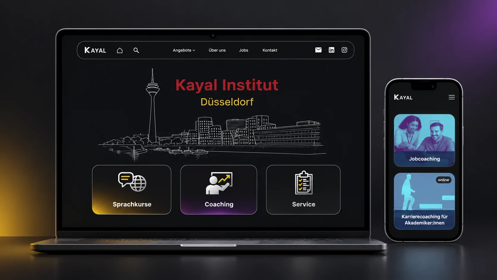
Dark surfaces and high-contrast typography give the website a strong, consistent identity. Yellow, purple and blue accents distinguish content without breaking the overall visual language. Rounded outlines, expressive imagery and a restrained navigation structure carry that character across pages.
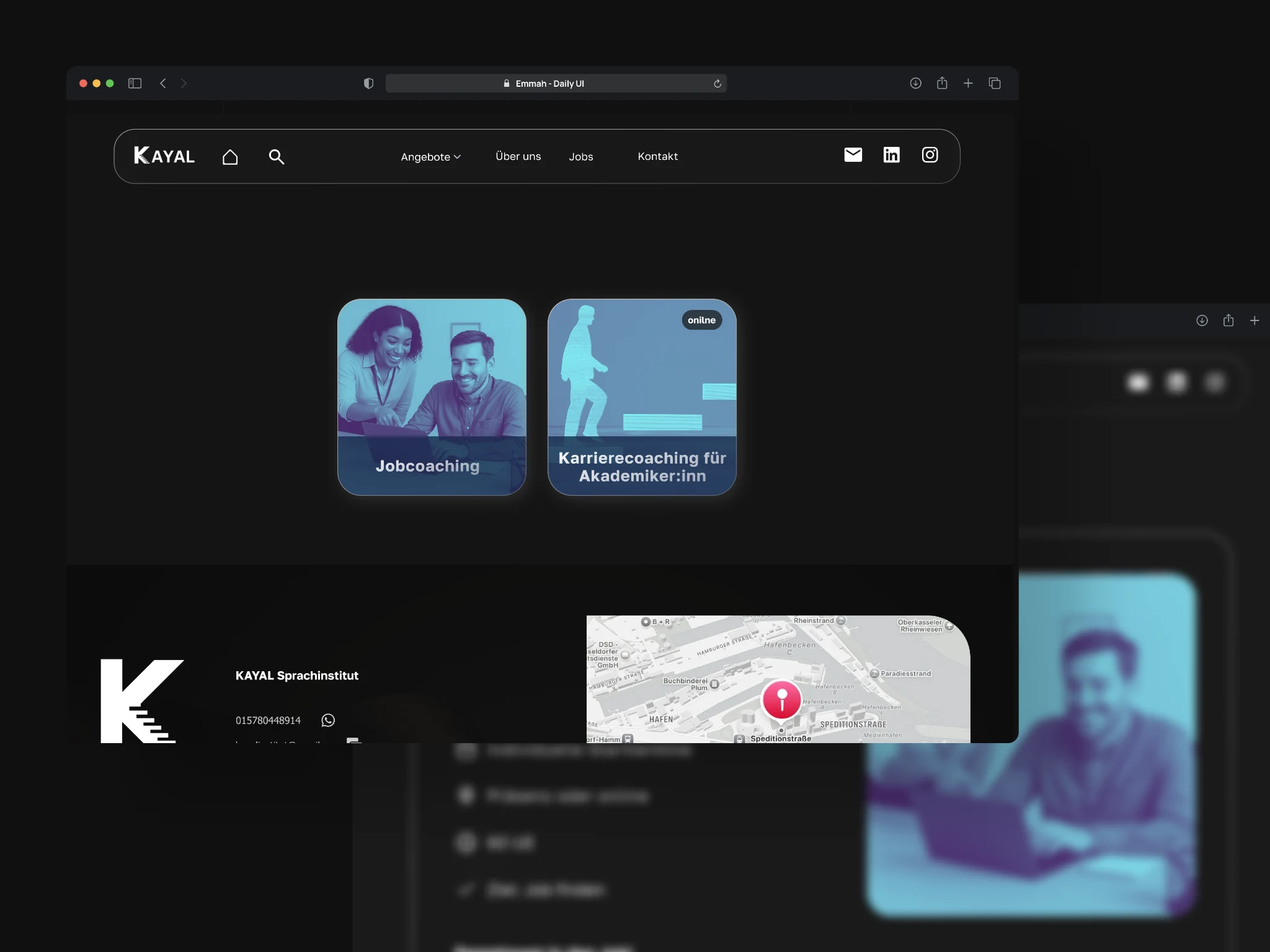
Organizing diverse service offerings
Different needs. A shared way in.
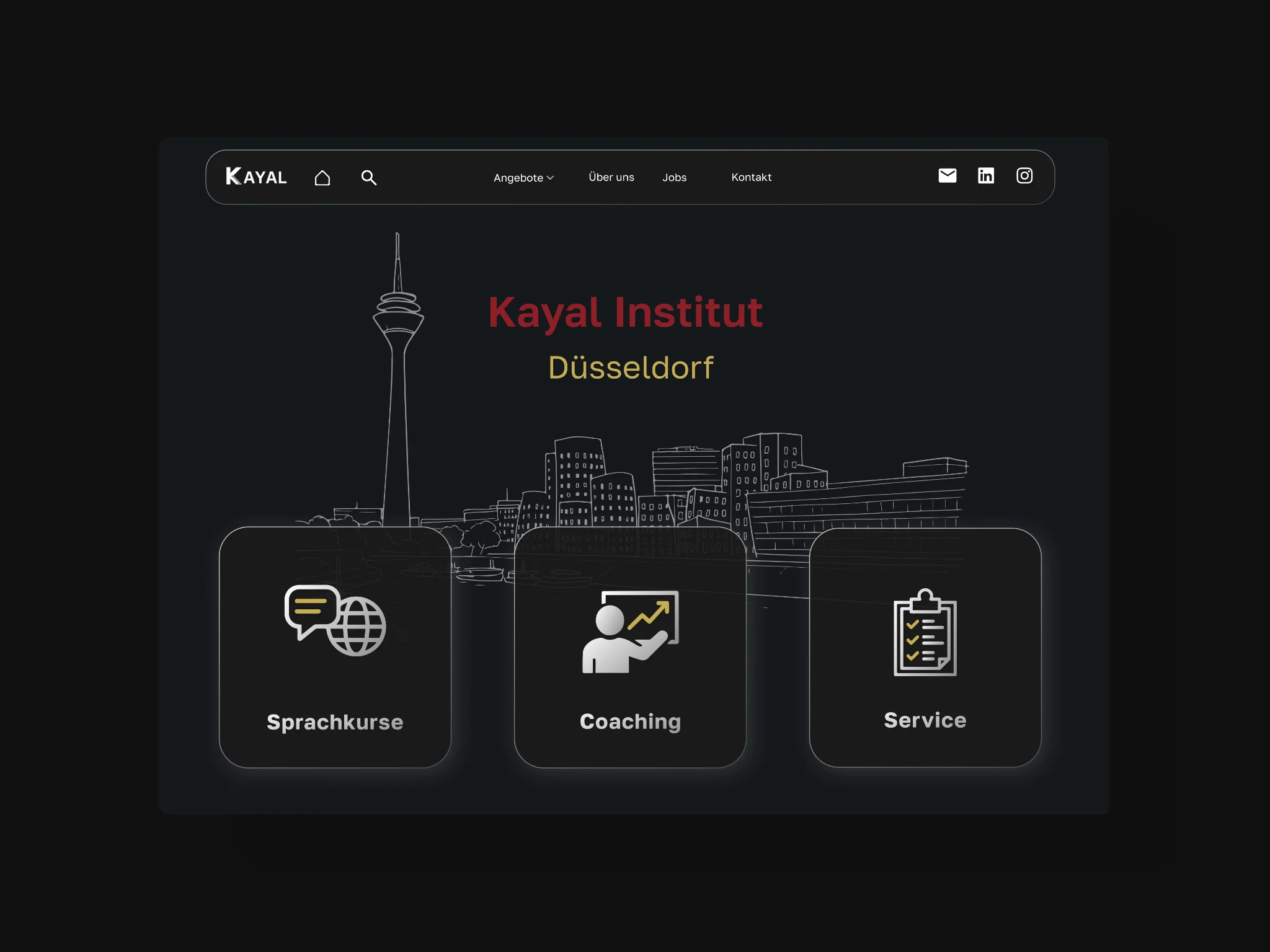
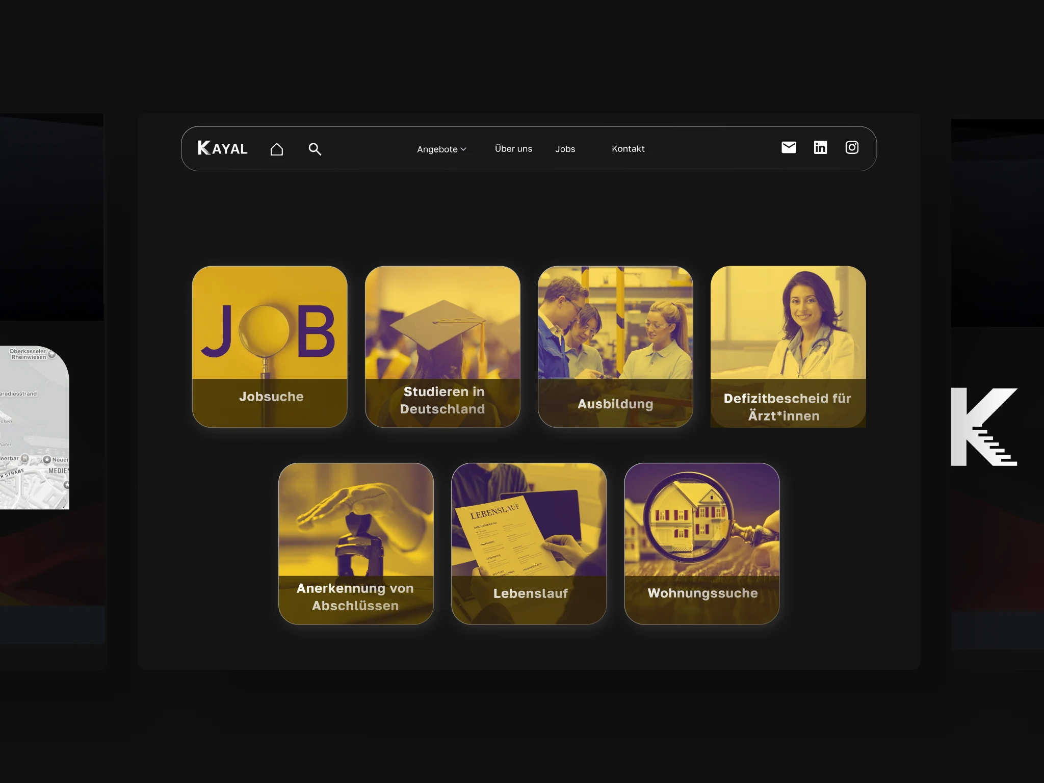
Language education, career coaching and professional services need their own space within one institute. Consistent category layouts, image treatments and clear labels bring them together. The service overview presents distinct routes, while the coaching page uses the same visual structure for its own set of offerings.
Responsive page design
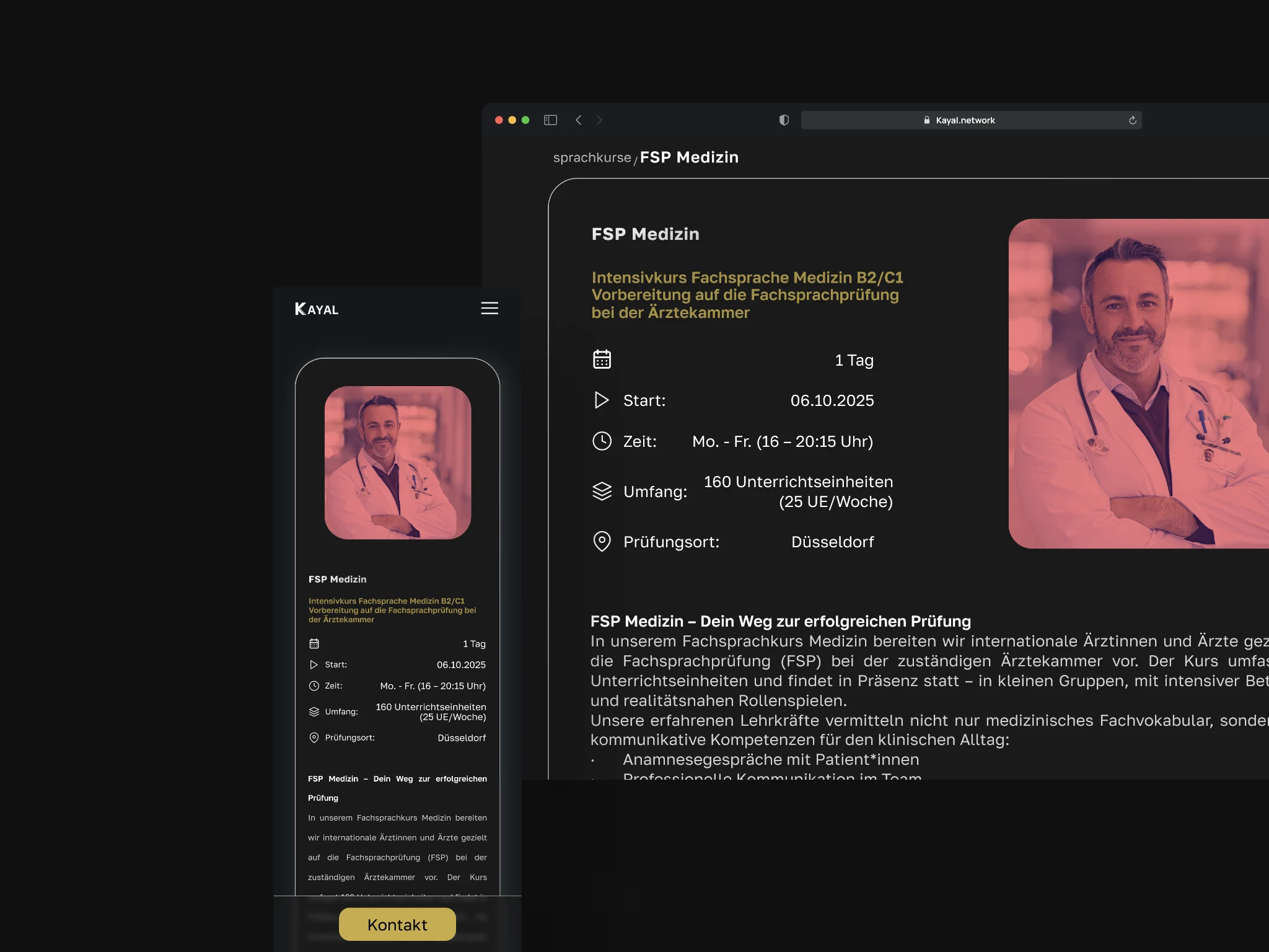
Keep the hierarchy. Adapt the composition.
The course-detail design places the course name, key information and contact action in a clear sequence. On desktop, the layout balances information with imagery; on mobile, it becomes a vertical flow. Typography, spacing and familiar components keep the experience connected across screen sizes.
Selected screens
One hierarchy, beyond the course pages.
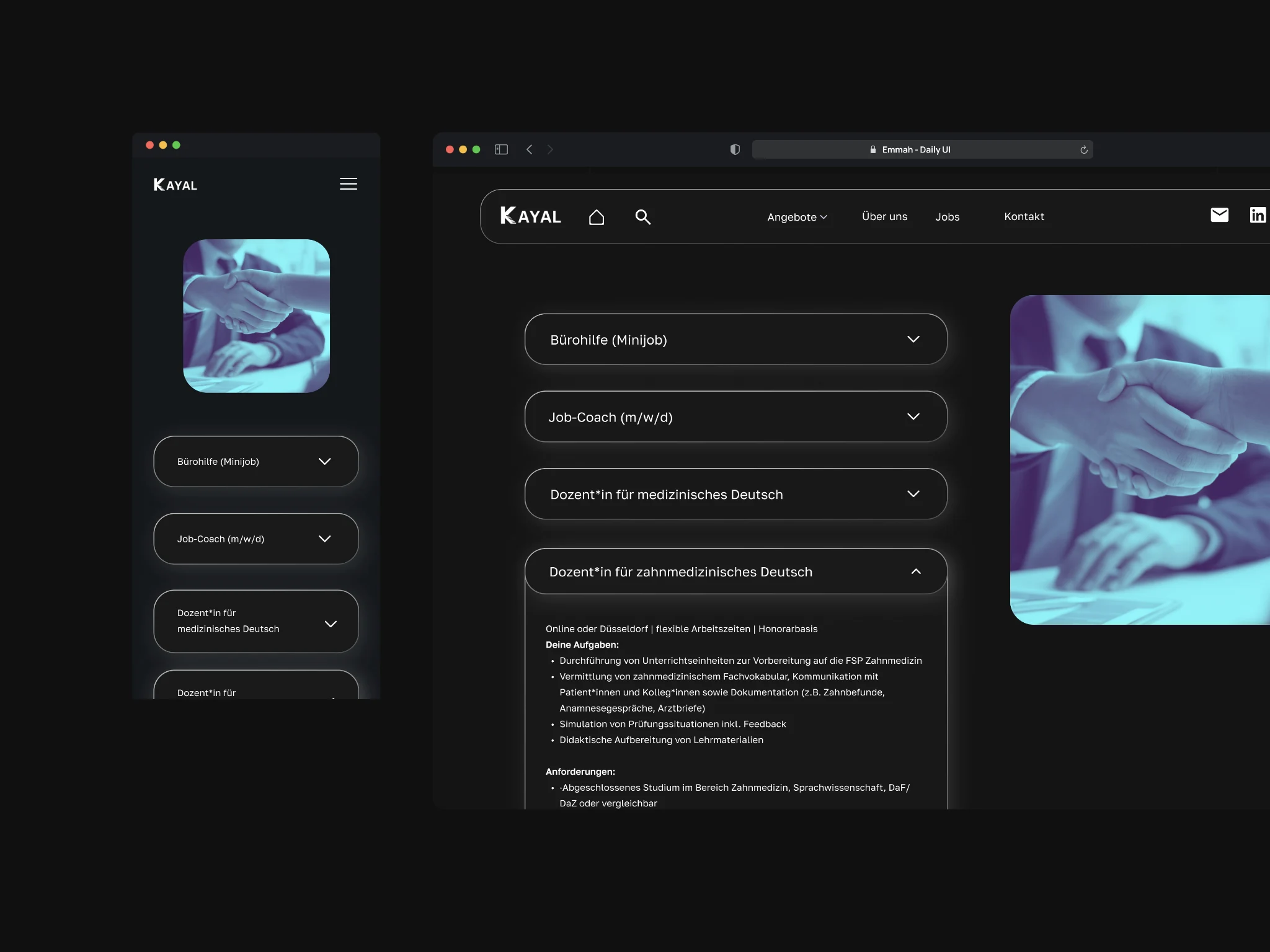
The jobs page extends the same dark surfaces, outlined components and image language to recruitment. Expandable listing layouts separate the role overview from longer descriptions, with desktop and mobile compositions designed as parts of the same system.