01 / GEO Fitness Club
Designing a brand
that doesn’t make excuses.
GEO is Geoffrey’s personal fitness and coaching brand. I translated his powerful presence and commitment to hard work, discipline, and consistency into a distinctive visual identity.
- Project
- GEO Fitness Club
- Scope
- Visual Identity / Website Design / Print Design
- My roles
- Visual Identity Designer
Graphic Designer
Website Designer
02 / The visual direction
Strength,
without the polish.
The identity deliberately moves away from the clean, friendly look of many mainstream fitness brands. GEO needed the attitude of a garage gym: direct, intense, and built around dedication.
Black and charcoal create the foundation; energetic red brings emphasis. Distressed, graffiti-influenced typography, high-contrast black-and-white imagery, and industrial textures work together as one visual language.
The grit has a purpose. It expresses Geoffrey’s character and uncompromising approach to strength training.
“Dedication has no limitation.”
03 / From brand to digital
Bringing the garage-gym attitude online.
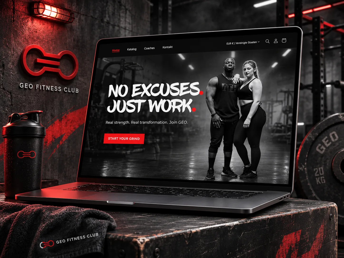
The website hero leads with “NO EXCUSES. JUST WORK.” Oversized expressive type establishes the hierarchy, while monochrome athlete photography places the person and the training environment at the center.
Against the dark garage-gym setting, sharp red accents draw attention to the message and primary call to action. Typography, photography, and contrast make the brand’s personality immediately clear.
The website mockup above shows this language coming together in a single, focused first impression.
04 / Print communication
One identity.
Across every touchpoint.

I carried the visual language into promotional materials for GEO’s fitness and coaching services. The same red-and-black contrast, bold type, and monochrome imagery connect the physical materials to the digital experience.
English and German flyer versions were created, keeping the brand’s message consistent across both languages.
05 / Design reflection
Designing for personality,
not trends.
A visual identity has to do more than look attractive. It should communicate the personality, values, and positioning of the person behind it.
For GEO, that meant choosing a deliberately gritty direction because it reflected Geoffrey’s philosophy. The visual decisions serve the brand’s character, rather than a passing aesthetic.