Dr. Navid Mohsenzadeh / Visual Work
An identity,
carried forward.
An eye-inspired identity in black and gold, carried from medical stationery into a first website and a later redesign.
- Design scope
- Visual identity, prescription and stamp design, and website design.
- Project evolution
- Original logo and stationery, first website, then a redesign using the same concept.
- Presentation
- Original supplied assets and two premium redesign mockups. No research findings or performance results are claimed.
Original identity
An identity shaped around the eye.
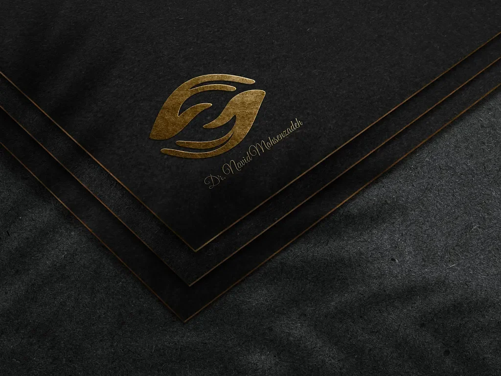
The original eye-inspired mark establishes the central concept. Curved forms suggest an eye, while the black-and-gold presentation gives the identity its visual character. This becomes the connecting element across the project’s print and digital stages.
Medical stationery
From a visual mark to everyday materials.
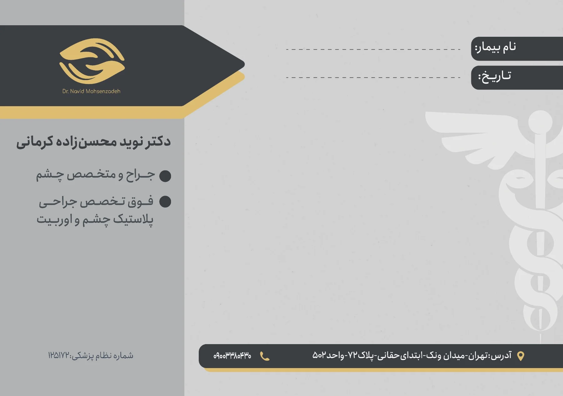
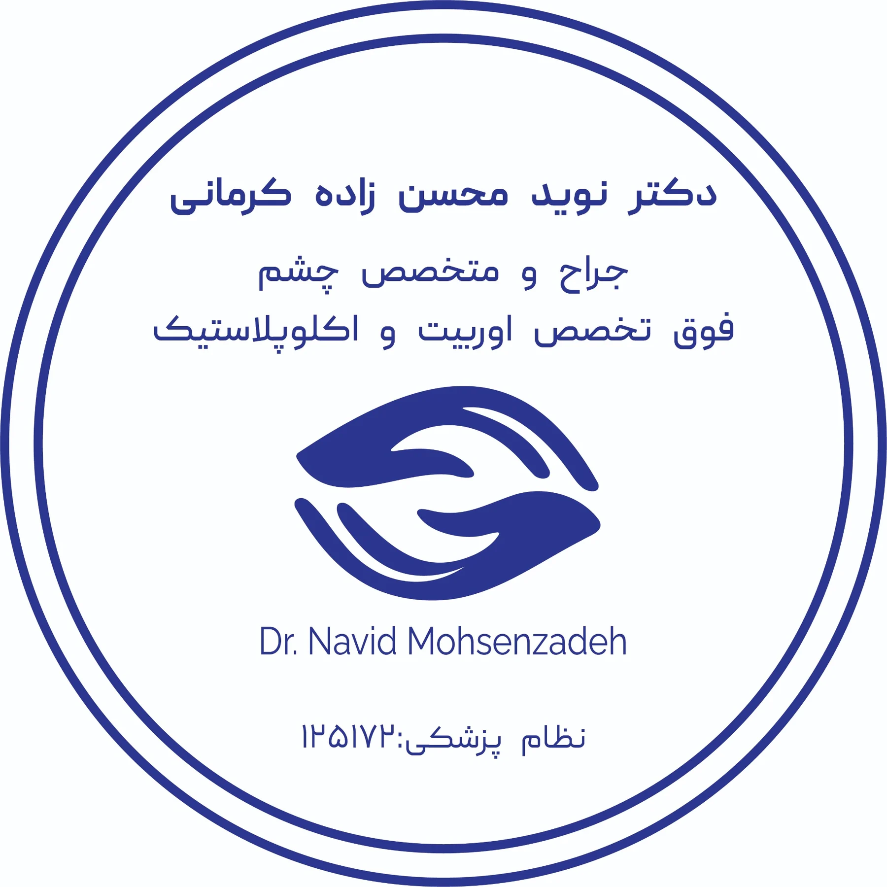
The prescription layout carries the mark into a practical medical document, with a clear area for patient information and writing. The stamp adapts the same symbol to a single ink color. Together, they show how the identity extends beyond its original presentation.
First website design
Bringing the concept onto the screen.
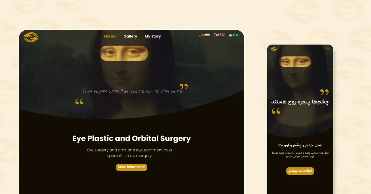
The first website extends the eye concept through art-led imagery, selective gold emphasis and dark surfaces. The supplied desktop and mobile composition shows the same visual idea adapting to two screen sizes. It is an earlier stage of this project, rather than a separate identity.
Website redesign
A new composition. The same underlying concept.
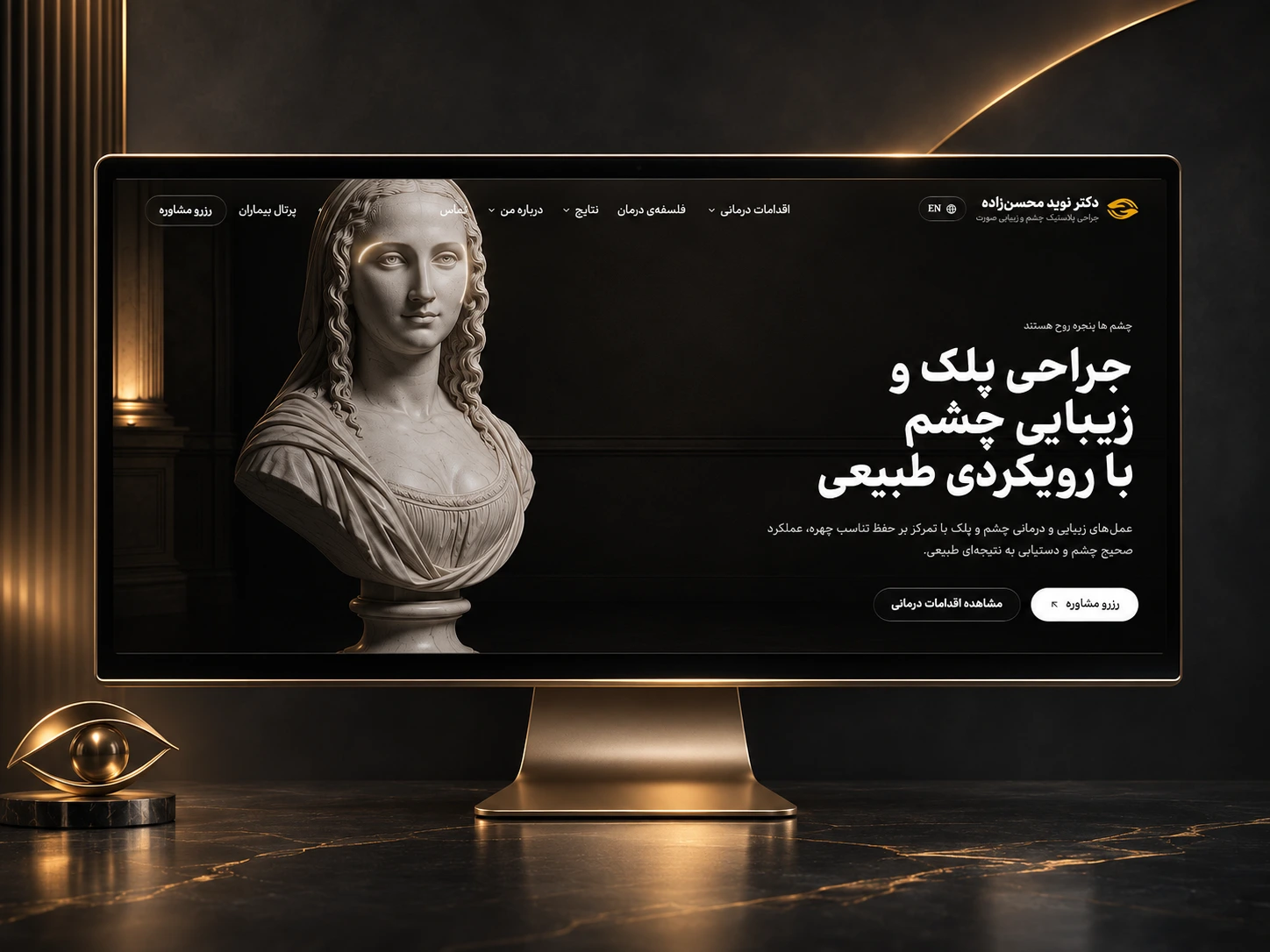
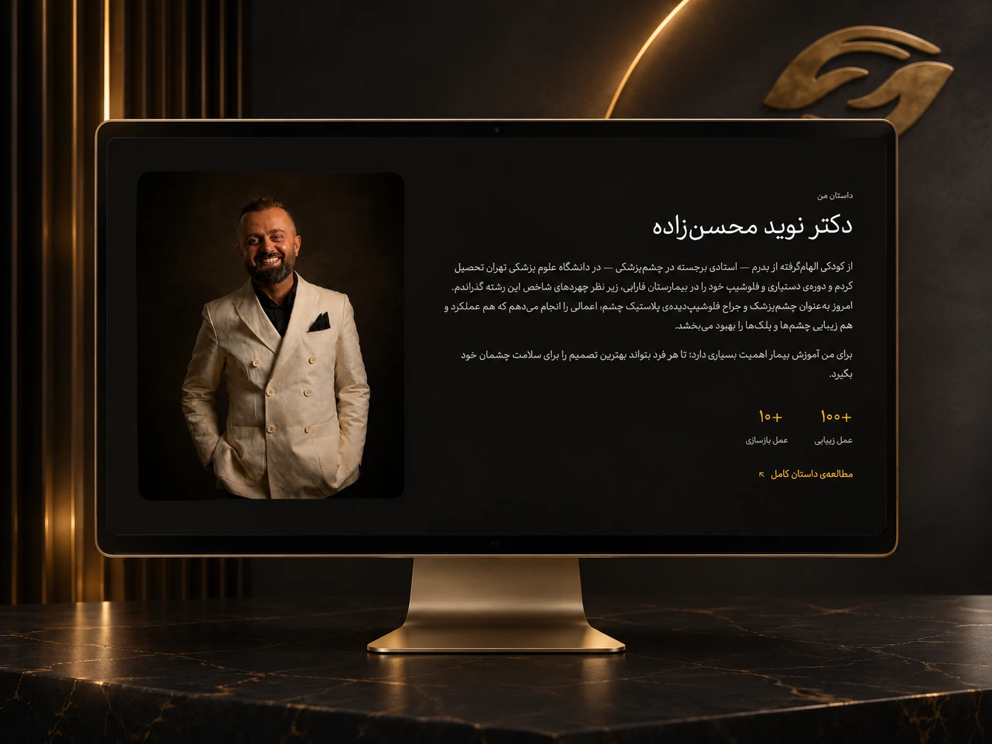
The redesign retains the eye-inspired mark, dark visual foundation and gold accents, while revisiting the page composition and typography. The hero and about-page presentations show the direction across two different screens: an image-led introduction and a more personal profile layout.